-

So here's another chart that I found interesting.
While, at the moment, the Wings site has almost an order of magnitude more total members,
the track of cumulative new members by day for January 2014 (to date) for the two sites does not look all that different...
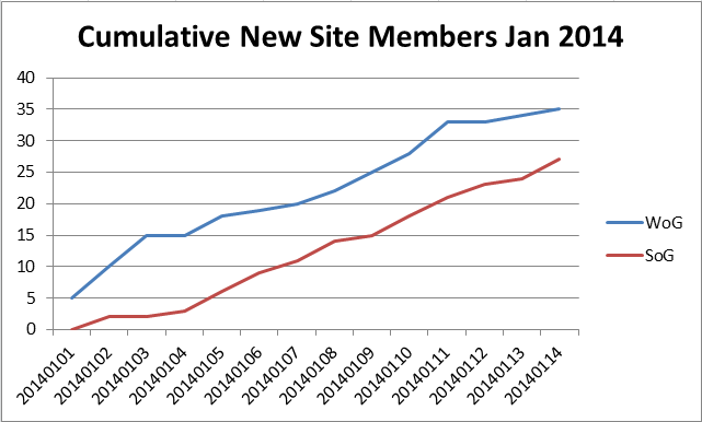
Of course, there could be all kinds of reasons for the chart looking like this over such a short period,
but I still found it interesting.
 Posting Permissions
- You may not post new threads
- You may not post replies
- You may not post attachments
- You may not edit your posts
-
Forum Rules


 Reply With Quote
Bookmarks